Since starting this blog, I have not given much thought to the overall design of the page itself. Which seems a bit ironic as an inspiring instructional designer.....
As part of one of our challenges this week, I decided to give my blog a bit of a refresh and change some of the décor style elements.
Before

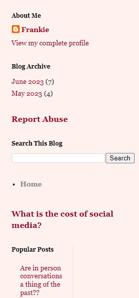
When I began the blog at the beginning of the semester, I chose a design that was simple and easily created. I chose this particular design and set up because it was how the blog came, I didn't dig too much into the design elements as I was focusing more on the content I would write about. My original design had the blogs centered and the widgets off to the right...very plain and simple and there wasn't much thought behind them.
For my refresh, I chose a more subtle them, using my favorite color for the background. I also chose to limit the amount of blogs that appear in my home screen. I did this because I know it can be quite overwhelming to see every blog ever posted all in one long drawn out screen. I also chose to place the widgets at the bottom of the feed. In this section you can see the blog archives for each month, the most popular blogs in my whole account, as well as search for blogs (I am assuming you would more use this section for a more established blog).
After


Overall, I am happy with the new design elements. I am sure that as I progress an become more comfortable in the blogging world, I will add/change other elements, and even research outside information to make the appearance even better!
Thanks for bringing up a pertinent topic for us IDers! I feel like I'm cobbling together my blog and projects with skills I learned prior to grad school. I would love to have a graduate class in design elements for learning. I like what you've done with your refresh. The simplicity works and the color is calming. Nice work!
ReplyDelete